MOBILE RESPONSIVE
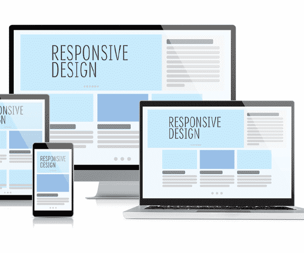
Surfing the internet from a mobile phone is the norm nowadays and knowing how to make a mobile responsive website has become more and more important. Mobile responsive design is all about automatically delivering your audience the content they desire, within the context that they’re viewing. It works on the motto of One website, multiple versions, eliminating the need for expensive app development or its maintenance.
What Is Mobile Responsive Website Design?
When a website design is responsive, the content or layout responds based on the size of the screen they are viewed on. A responsive website automatically changes to fit the device you’re reading it on, hence giving the visitors of your website the best experience possible on their mobile phones, without forcing them to adapt themselves.A mobile responsive website includes different design elements such as:
- Readable text without requiring zoom
- Adequate space for tap targets
- No horizontal scrolling
Why Responsive Design is Important for Business
Nowadays a website needs to look great and work well on a desktop, a tablet, and a smartphone’s browser. Responsive web design can help you achieve all of this. Some of its most commonly found benefits are:
- Increases reach to customers and clients on smaller devices
- A consistent experience that can increase sales and conversions
- Maintains a consistent user experience which increases retention
- Time and cost on-site content management is decreased
- Makes you stay ahead of the competition
One of the best ways to ensure that your website is ready for more mobile visitors in the coming years is to create a responsive website design. Making a mobile responsive website is not as difficult as one generally thinks. Building your own website is no longer a very expensive project and website builders like us present at Hordanso charge you a transparent, monthly fee for our services. Hence, that saves you from handing over thousands of dollars to a random freelancer without knowing what you’re getting yourself into.
So, want to build your own responsive designs? You’re just a few clicks away from owning a mobile-friendly website online.